
The visual language
Colour, type and motion say how things look. This page names the shapes everything is built from, so a screen you have not seen yet still feels familiar.
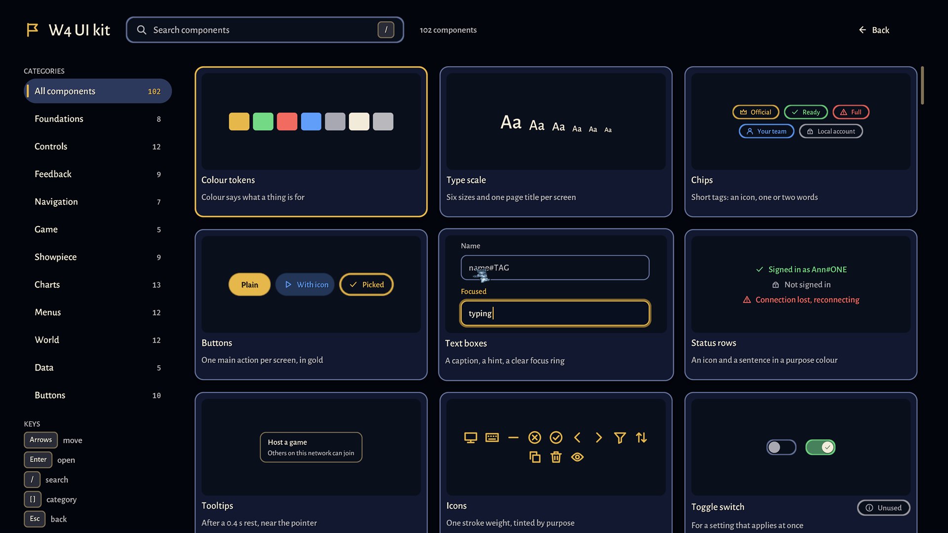
Capsules
Anything you press is a capsule: a fully rounded bar with an icon and a word. There is one family with a few roles.
- Gold, filled: the one main action of a screen.
- Tonal (blue): a normal action, or a step such as Previous and Next.
- Outline: a choice that is not the main one, such as Sign in.
- Ghost: Back and other quiet actions; only a label and an icon until you hover.
- Danger (red): actions you cannot undo. They ask first, or you hold them to confirm and a bar fills as you hold.
A capsule rises a little under the pointer, sinks when pressed, shows a ring when you reach it with the keyboard, and can show a busy, done or failed state in place, so you never wonder whether it worked.
Chips
A chip is a small outlined pill with an icon and one or two words, in the colour of its purpose: gold for official, green for ready, red for a problem, blue for your team, grey for local. A chip says what something is. It is never clicked; if it can be clicked it is a capsule.
Keycaps
A key you can press is drawn as a small rounded square with its name: Esc, Enter, F10. They sit beside the thing they trigger, on buttons, in menus and in tooltips, so you learn the shortcuts by looking.
Palettes
Press Ctrl+K on the menu screens or in a game to open the command palette: a glass card with a search field and a list. Typing narrows it with fuzzy matching and lights the letters that matched; the arrows move, Enter runs, Esc closes. In the menu it can open any page, any kit component and the common actions; in a game it holds about a hundred: selecting your hero, the army or the main building, moving the camera to your base or hero, opening chat to everyone or to your team, and the menu, minimap, log, restart and leave. Each row has a purpose icon, a category chip and, where there is one, the key; the commands you use most come first.
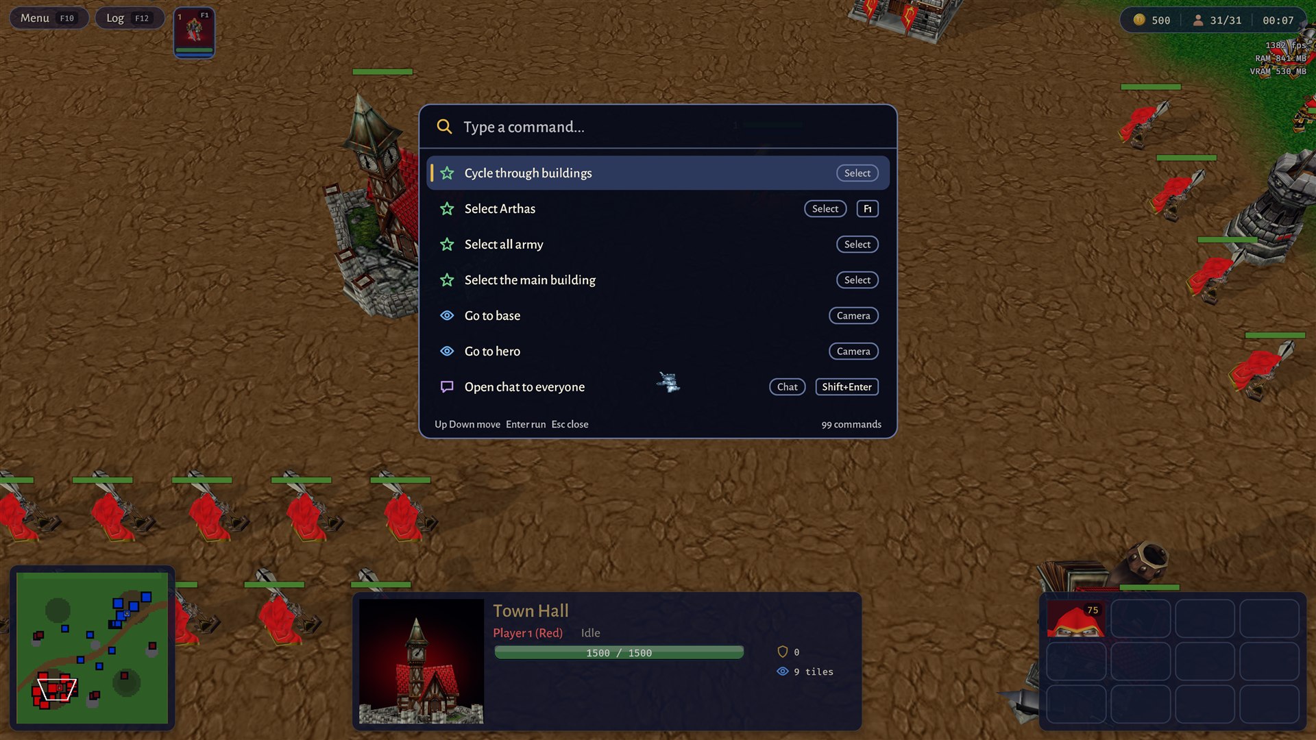
It never plays the game itself: the game runs the action the same way the key or button does.
The loading screen
Loading says what it is doing. The map's name and picture, a gold bar that moves only when real work finished, chips for what is loading, and a tip, over the animated start scene. When it is done the bar fills, the screen waits a beat and fades out.
The game menu
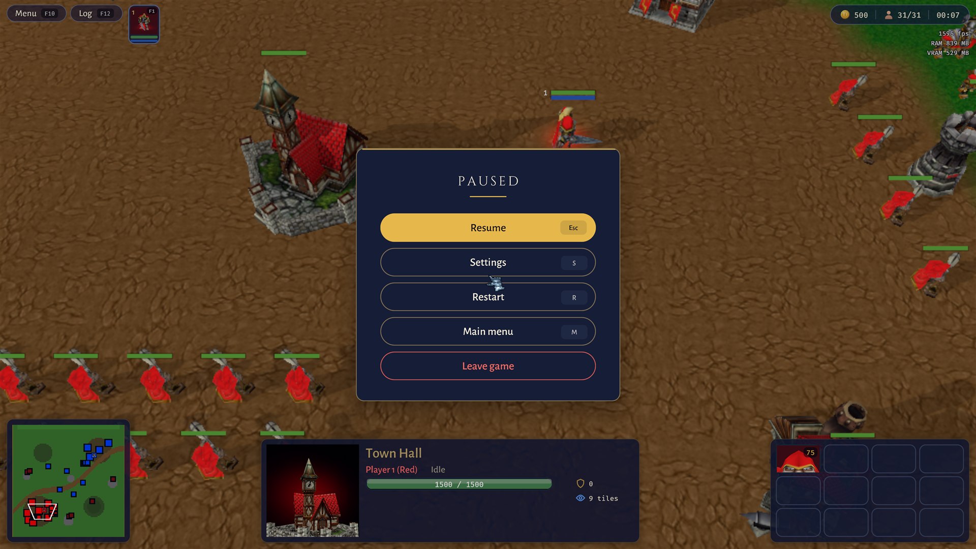
Esc in a game opens a card titled Paused over the game: a gold Resume with its Esc keycap first, then outlined Settings, Restart and Main menu, each with its letter key, and a red outlined Leave game at the bottom, away from Resume. The game behind is dimmed and softly blurred, never hidden, so you remember where you were.
Unit icons
Every unit, building and hero has a round portrait in a frame that carries its owner's colour: on the selection card, the command card, the hero buttons and the minimap. The colour is never the only sign: heroes carry a level and everything shows its health.
The selection card and the command card
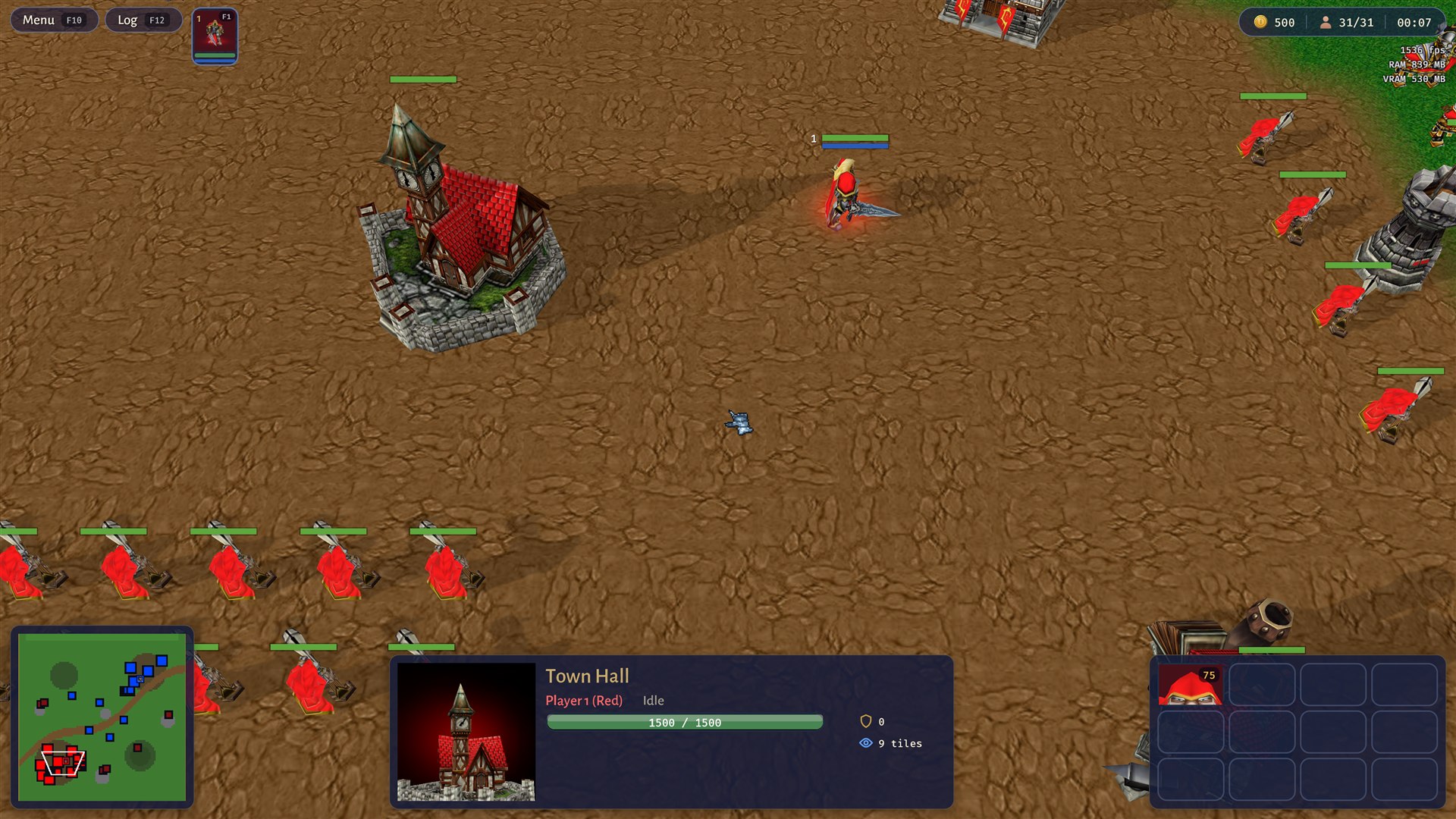
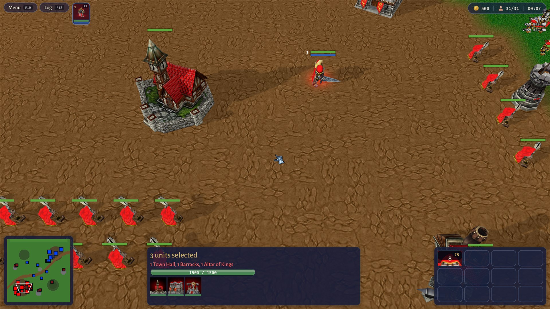
Select one unit and the bottom card shows its portrait, name, owner, state and health, with mana for heroes. Select several and it says how many and lists what they are, with a small portrait for each unit under its own health bar. Armour and sight sit at its right edge as small icon read-outs. The hero's button sits top left with its portrait and hotkey. The command card at the bottom right is a grid of square slots: the icon, its cost or hotkey in the corner, and a veil that sweeps clockwise while an ability recharges. Empty slots stay as quiet outlines so the grid never moves.
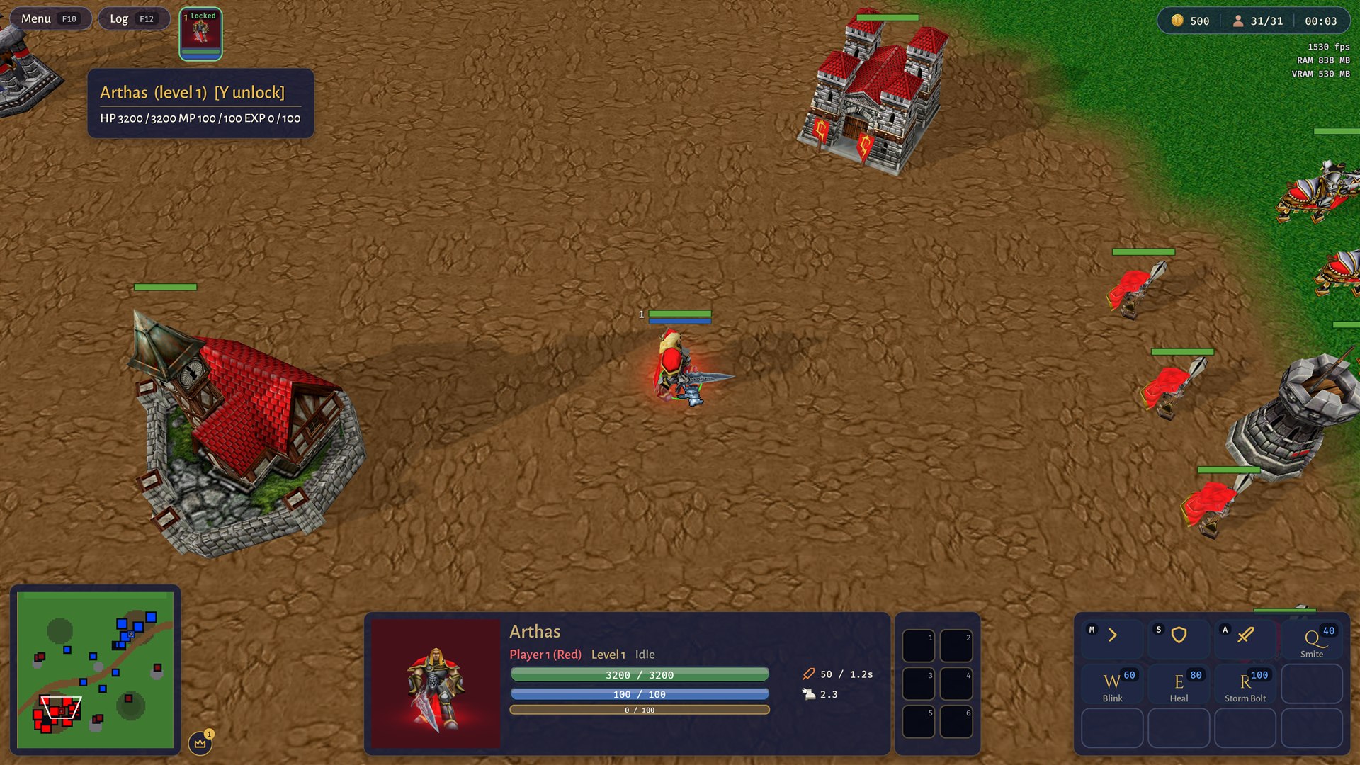
Select a hero and the card grows: level, health, mana and experience bars, attack and speed, six item slots beside it, and on the command card the movement row (Move, Hold, Attack) above the abilities, each slot with its key and mana cost. Point at the hero's button for its numbers.
Online games
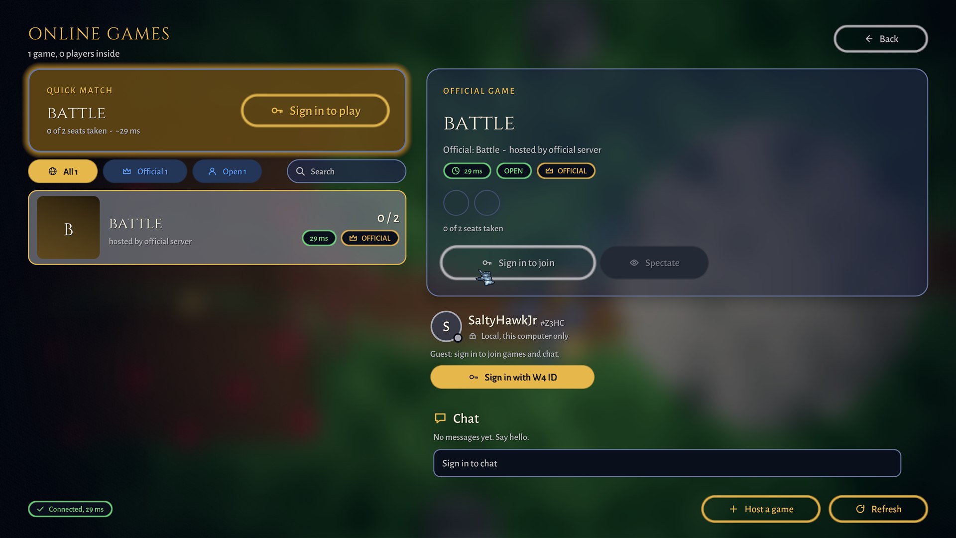
The games screen leads with a gold Quick match slab, then filter chips (all, official, open) with a search field, the list of games with ping and Official chips, the picked game's details, your account line and a chat. Signing in is the gold action when you cannot join yet.
Rooms, settings and the map picker
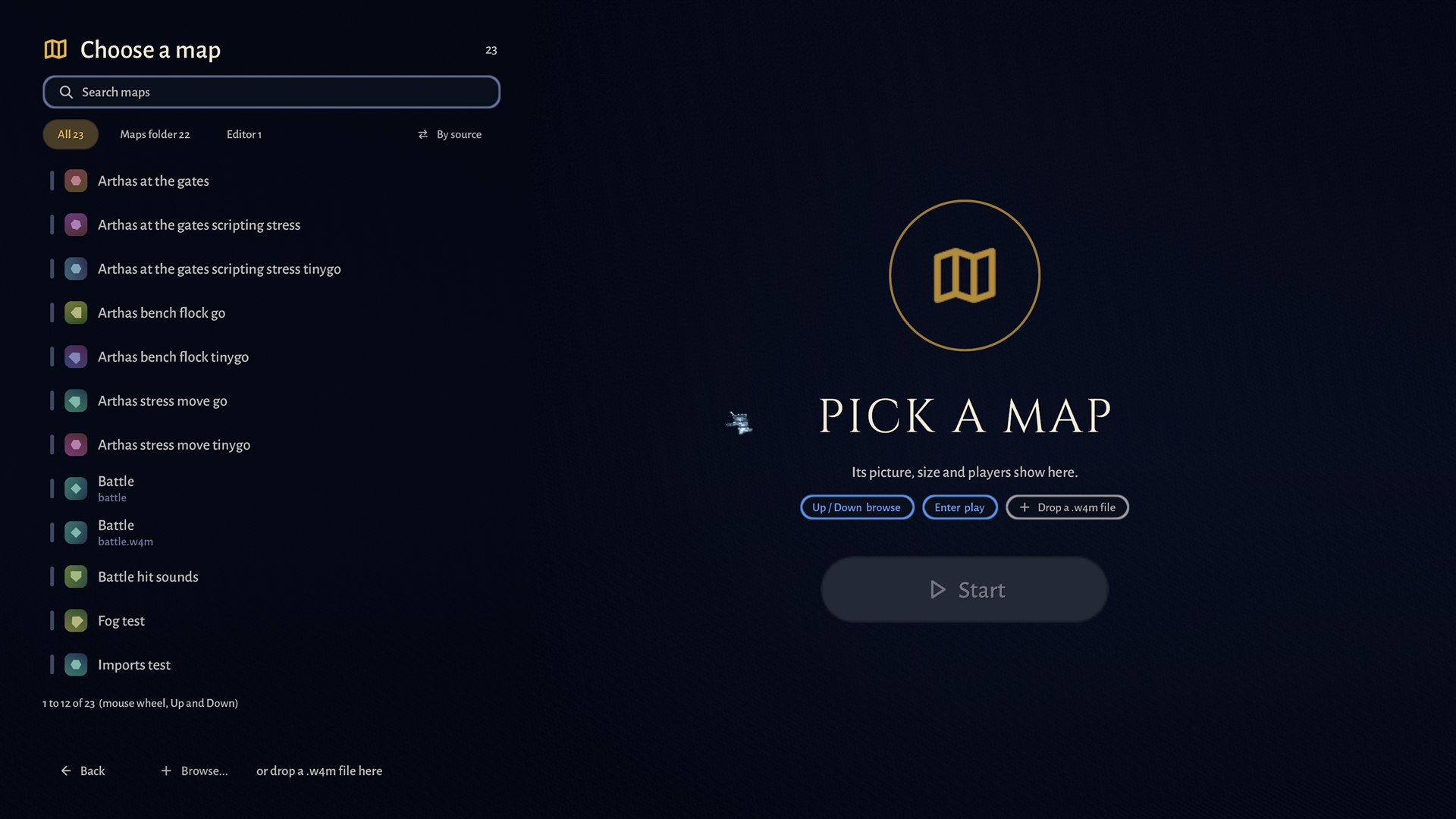
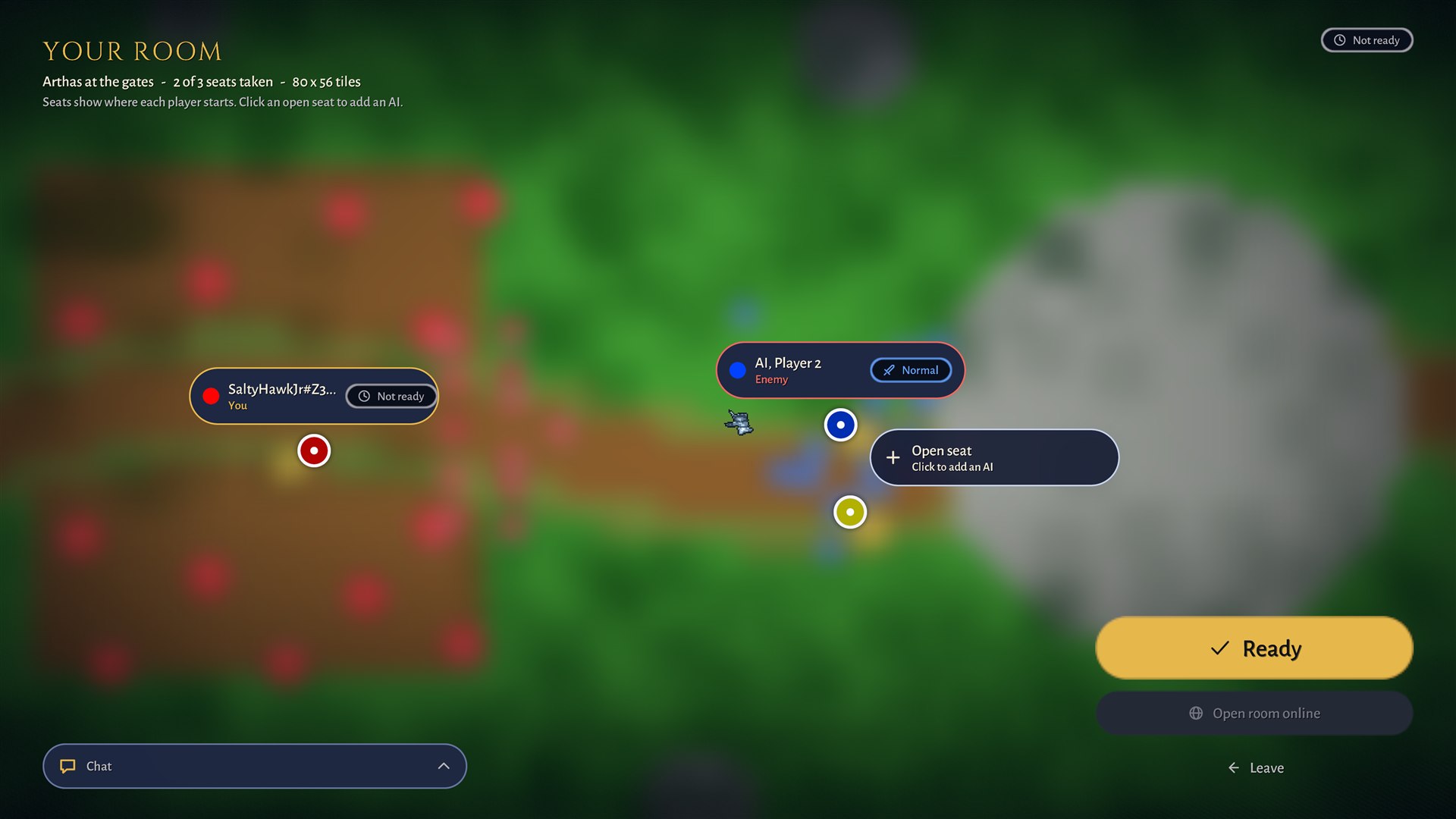
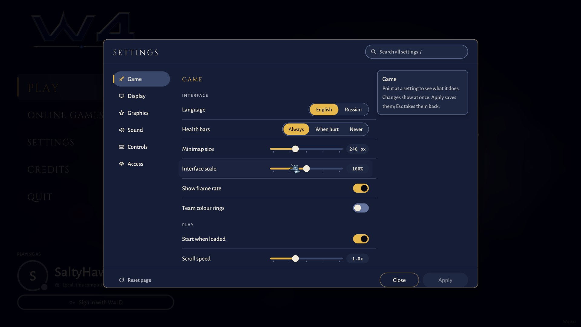
The pre-game screens use the same capsules, chips and cards. The map picker is a searchable list with filter chips (all, maps folder, editor), a sort toggle and a count; the right side shows the picked map's picture, size and players, and the gold Start button waits until you pick one. The room lays the map out blurred behind you and puts each seat on it where that player starts: a capsule with the player's colour, name, "You" or "Enemy", and a state chip such as Not ready or an AI's difficulty. An open seat says "Click to add an AI". The gold Ready button, Open room online and Leave stand bottom right, and a Chat tray folds up bottom left. Settings are one sheet over the dimmed menu: pages on the left (Game, Display, Graphics, Sound, Controls, Access), rows with a switch, slider or choice and its value in a mono read-out, a search field at the top, and a side note that explains whatever you point at. Changes show at once, Apply saves them and Esc takes them back.
One backdrop, and the end of a game
The map picker, the room, the loading screen and the results screen all stand on the same backdrop: the picked map's picture, heavily blurred, with a soft vignette at the sides and a slow drift, crossfading when the picture changes. With reduced motion it does not drift and the fade is instant. Because they share it, the screens before and after a game feel like one product.
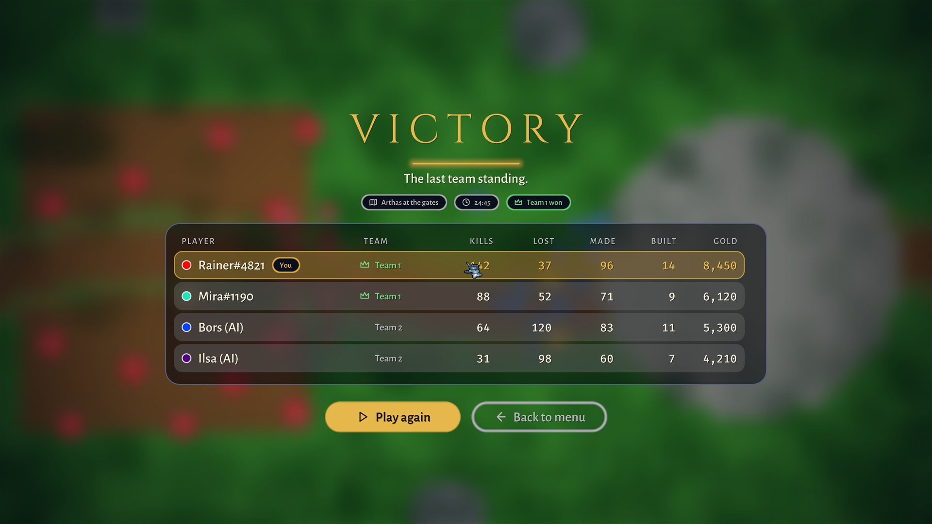
When a game ends, the results screen shows a large tracked VICTORY, DEFEAT or DRAW in the colour of its meaning, the map and the game time as chips, and one glass table with a row for every player: kills, losses, units made, buildings built and gold earned. The best of each column is in gold and your own row is ringed. Under the title a line says why ("The last team standing."), and the table also shows each player's team with a crown for the winners. Two ways on: Play again, in gold, and Back to menu. It only reads the counters, which are the same on every machine, and sends nothing.
Teammates and messages in a game
Under the hero buttons, each teammate has a round portrait of their hero: a rim in their colour, a health ring, their level on a small badge, a thin mana tick and their gold below. Hover for the numbers; click to look at the hero, and click again soon after to follow it. Messages sit above the console and fade; the log window keeps the whole history, and the chat box opens with a completion list. All of it is built only while it is on screen.
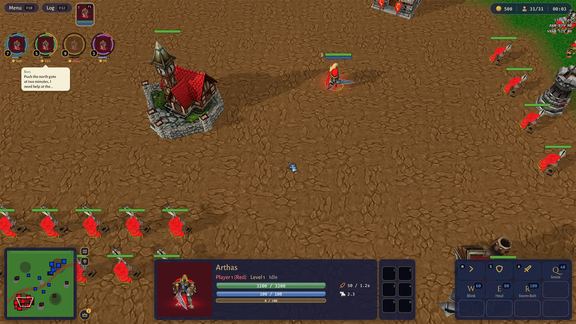
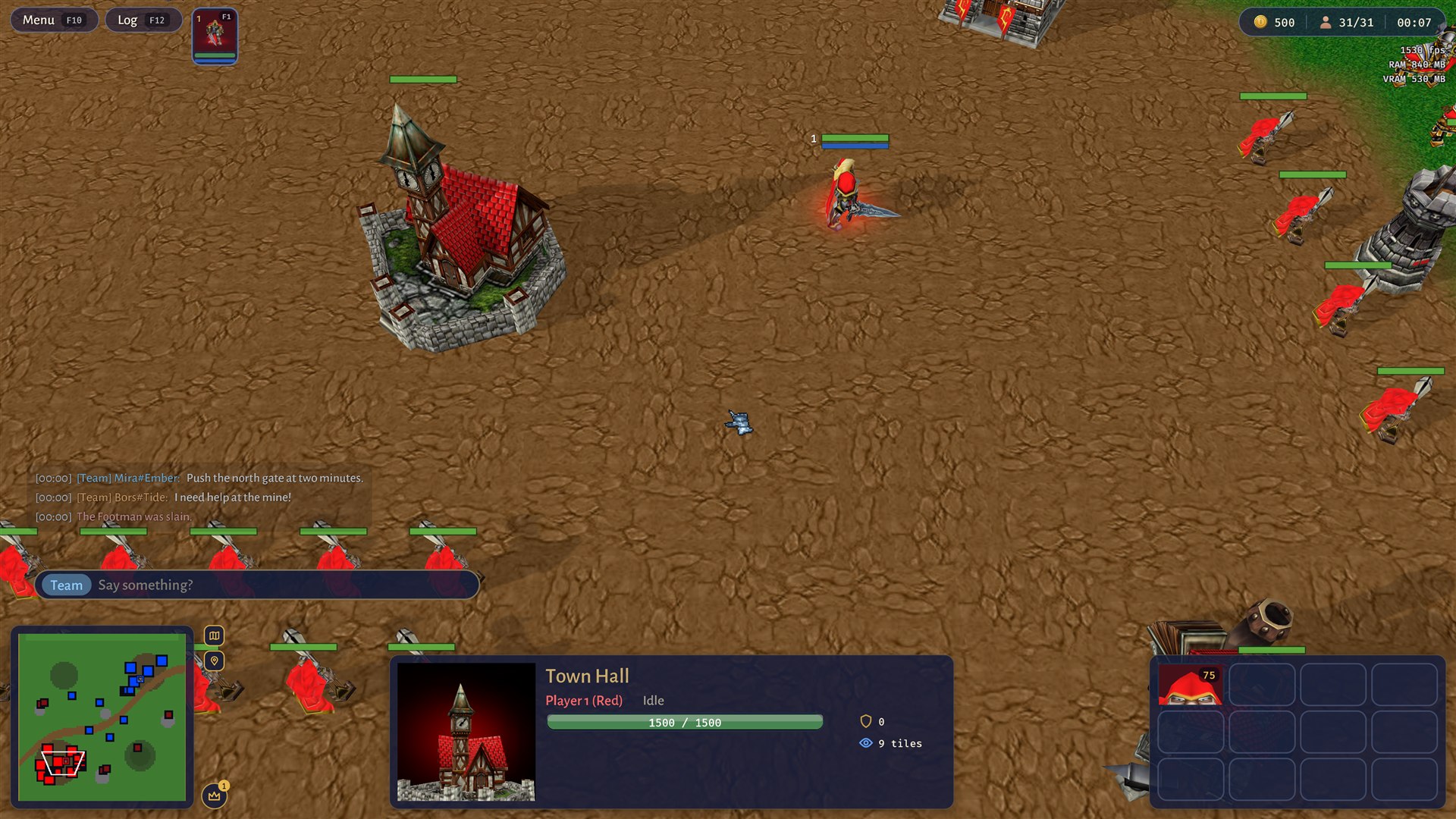
Chat lines are coloured by who said them and stay quiet; the chat box shows its channel as a chip (Team here) and a prompt.
Message kinds
Messages are plain lines, small, with one shadow and no box, and they fade fully out; the log window keeps all of them. A kind is a mark followed by ordinary text: a debug note is not in the chat at all: it goes to the log window and, if the player turns it on, to a small dim monospace readout in the top right corner, (WARNING) in amber, (ERROR) in red. Scripts raise them with game.Debug, game.Warning and game.Error, and the log has a Debug filter chip. Script text may change colour inline with [#RRGGBB] and [/]; it is cleaned and length-limited, so a script cannot fake a team tag or a system line.
Rules for the pre-game screens
- Back is top right, the same outline capsule in the same place on Games, Credits, Teams, Room, Account and the map picker. The one main action (Ready, Start, Host a game) is gold and sits bottom right, or in the middle of an empty state.
- One backdrop. These pages and the loading screen stand on the picked map's picture, blurred, with a vignette and a slow drift. If the map has a loading picture (a setting in the editor's map settings), that picture is used; otherwise the generated preview.
- Your room. The room page keeps its idea: the title YOUR ROOM, a seat for every player that says who plays there (you, an ally, an enemy, or an open seat that takes an AI), your ready state always visible, and one big gold Ready. Seats and layout can be restyled; the room is never turned into a plain list.
- Teams shows the map large with each player's start ringed in their colour. Rings that would overlap fan out round their midpoint, with a small dot at the true start.
- Continue on the main menu appears only when there is a last map: its name, one facts line and its poster, and one button.
One size at every resolution
Every screen is laid out in design units: a window 1080 high and at least 1600 wide. 1920 by 1080 is scale 1 and 3840 by 2160 is scale 2, so a higher resolution only makes the interface sharper, never smaller. A narrow window shrinks the whole interface to fit, and an ultrawide keeps the height's scale and centres the content while the backdrop fills the width. This is the same rule as the type sizes.
Where to see them
All of it is on the kit page (F2 on the main menu). Add to the kit first, then use it; see Components.